beer cans
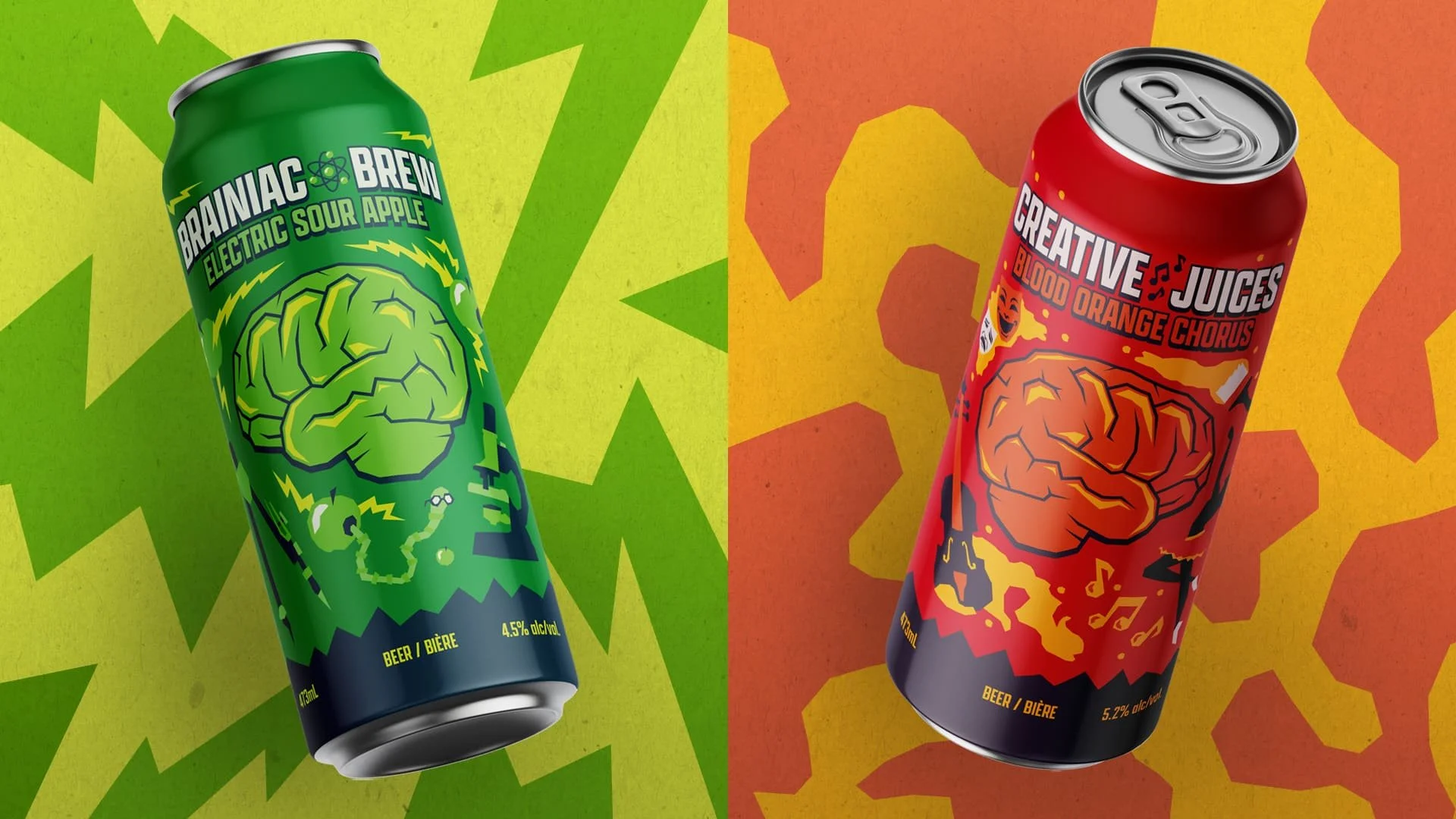
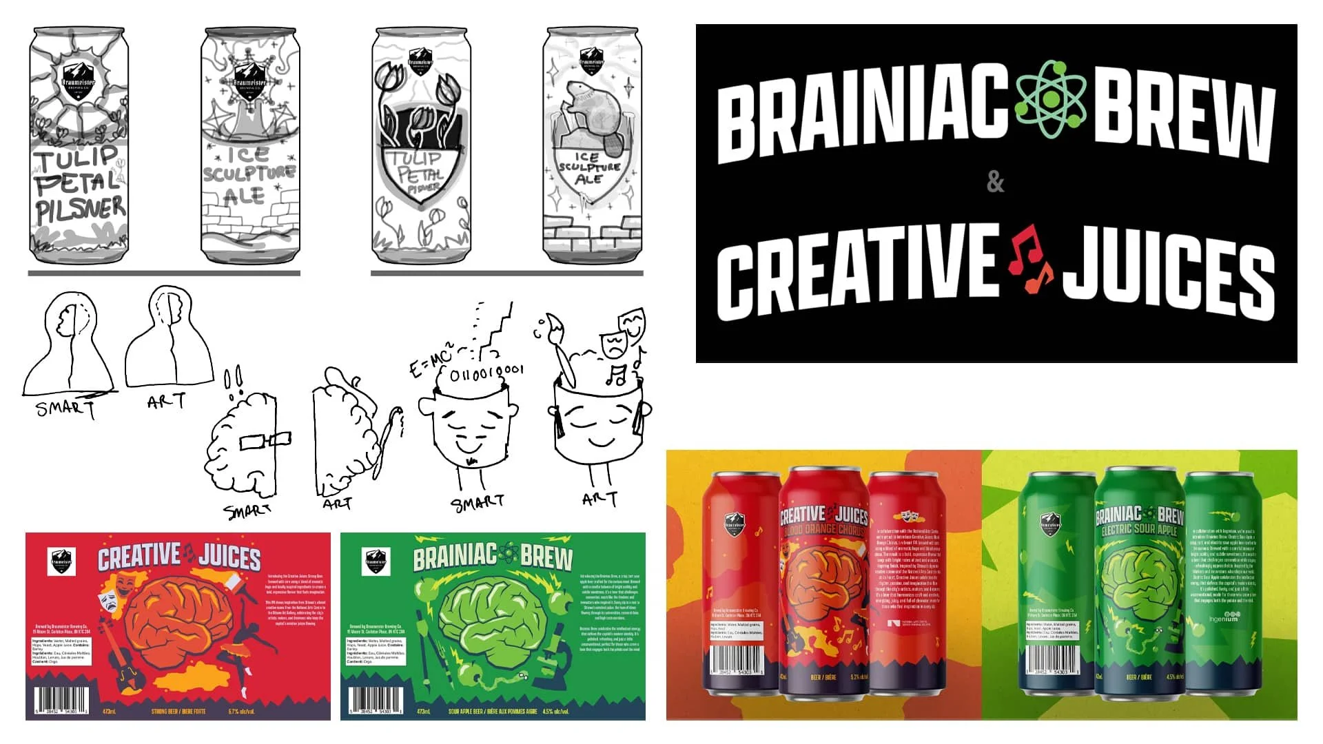
This project was one I had been looking forward to after seeing the work of previous students over the years. We were tasked with designing a pair of beer cans inspired by the city of Ottawa, with the goal of creating two designs that felt cohesive as a set while still remaining distinct on their own.
label design
reflecting
Early on, I felt that my initial ideas were quite surface-level and didn’t reflect a deeper understanding of the city.
digging deeper
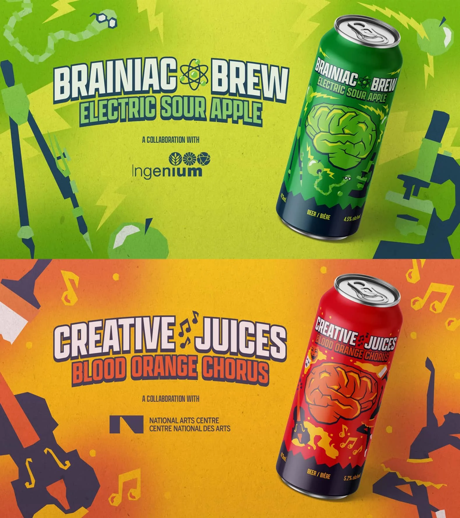
That realization pushed me to think more critically about what defines Ottawa beyond obvious references. I began focusing on the contrast that exists within the city itself, its academic, scientific, and political side along with its creative, artistic, and cultural side. I chose to represent this duality as two halves of a brain, one representing “smarts” and the other “arts,” with each drink complementing the other both visually and conceptually.
cheers!
The first can, Brainiac Brew, represents the “smarts” side of the city and leans into a more analytical, structured feel through its cooler color palette and technical imagery. The second can, Creative Juices, completes the brain by facing the opposite direction and shifts into warmer tones and more expressive visuals inspired by the arts. While each can stands on its own, they’re designed to work best together, visually completing the brain and conceptually highlighting the balance between logic and creativity that defines Ottawa’s character.


