Maker house
For this project, we were asked to redesign the logo of a local business. I chose Maker House because I’ve always been a fan of their brand, but felt it didn’t fully capture how playful and hands-on the space actually is.
logo redesign
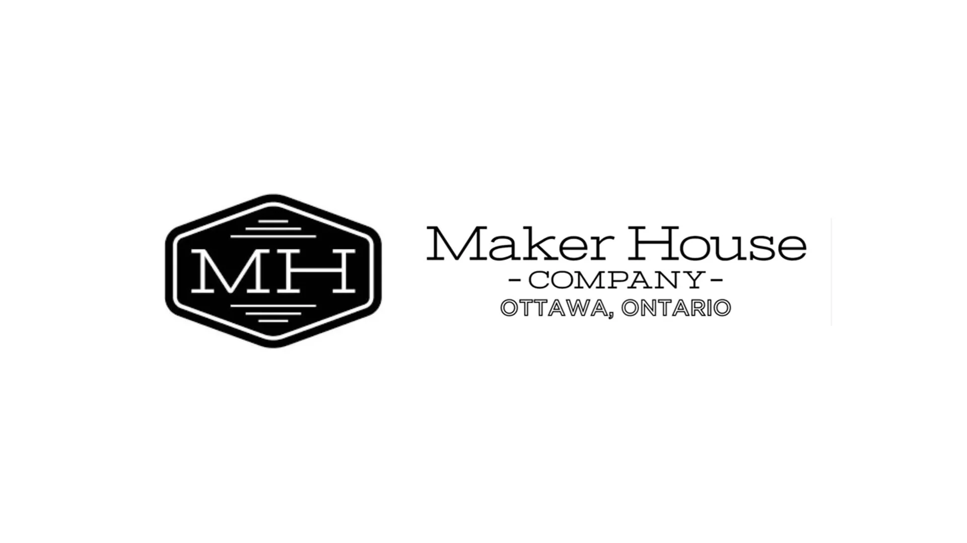
original logo
The original Maker House logo always stood out to me as I feel it doesn’t communicate the energy, creativity, or tactility of the brand.
making it work
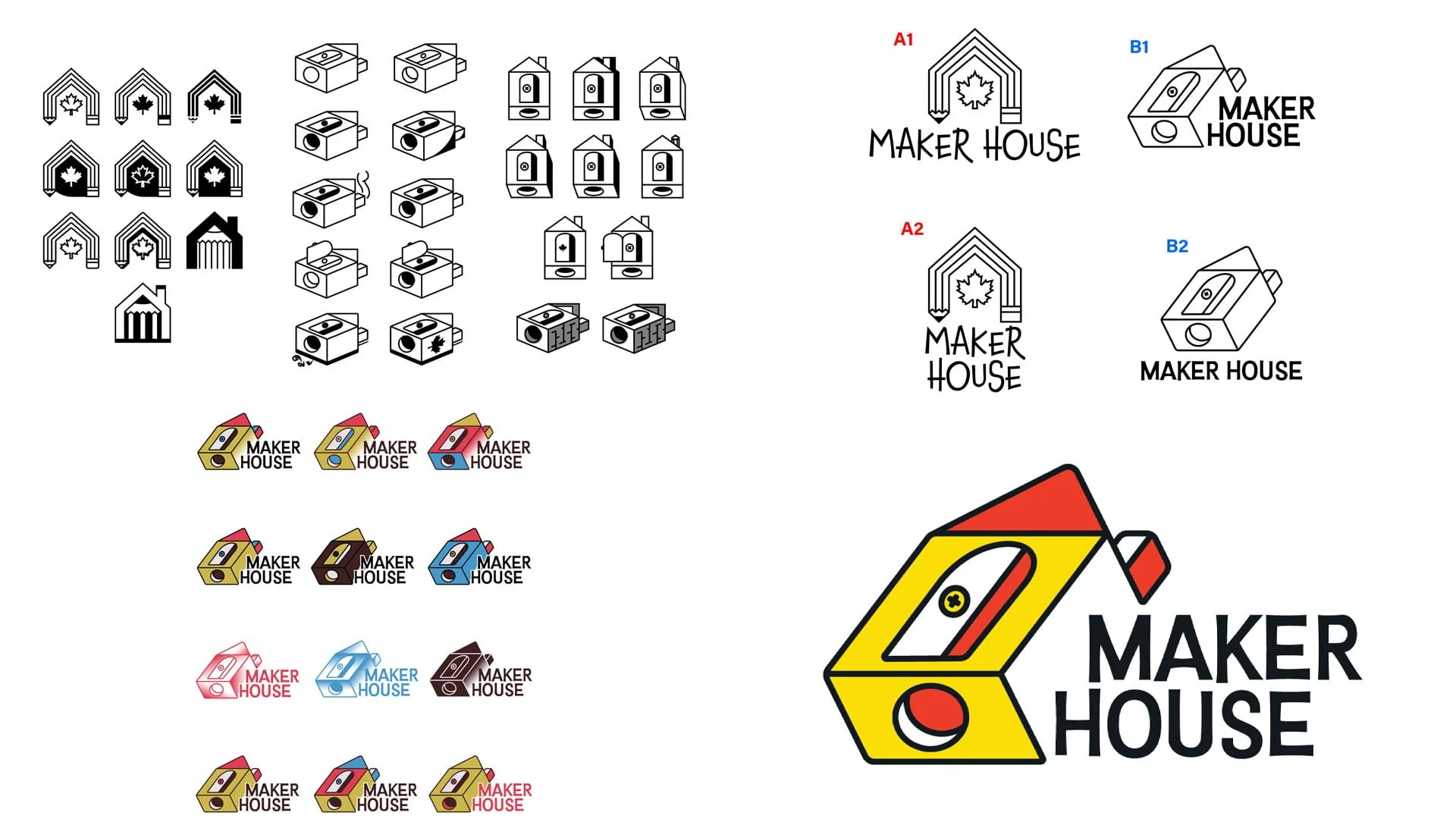
I knew from the beginning of this project that I wanted the logo to feel interactive. I tested different ways to achieve this feeling, like tracing 3D renders of houses and including a door or windows. These rough explorations helped move the project in a more physical and building-block-like direction.
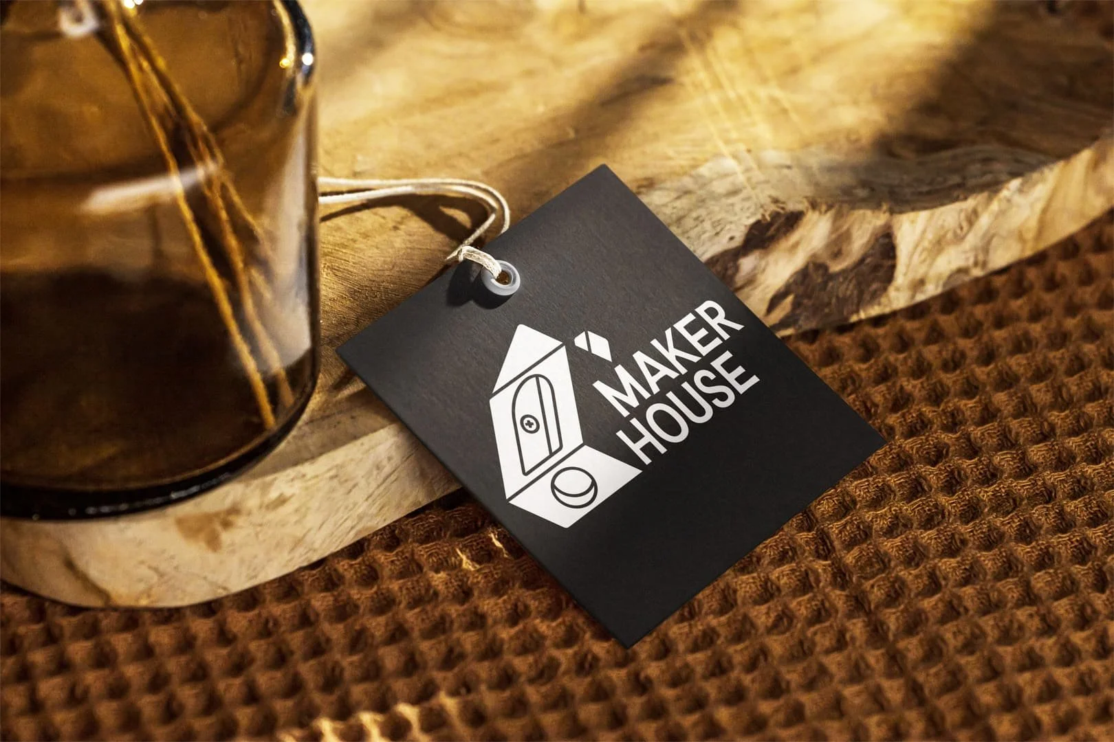
house fit for a king
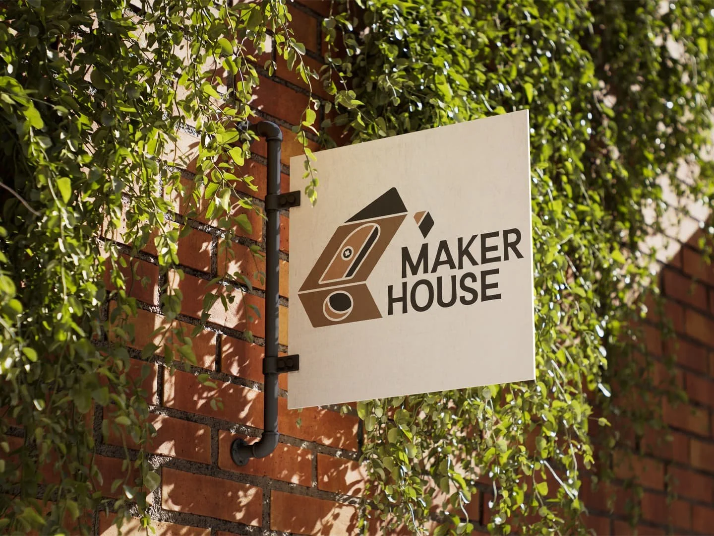
I landed on a pencil sharpener house icon with one side punched out, allowing the words to get incorporated into the logo as well. The missing section also invites the viewer to mentally complete the image instead of presenting everything fully. I pushed this concept by removing the line work and featuring only the shapes that make up the icon. This helps the logo’s legibility while giving it a puzzle-like quality, highlighting the structure of the house and emphasizing the process of building as much as the finished form.